

Helping patients stay on track
Designing a clinician-supported weight management program app
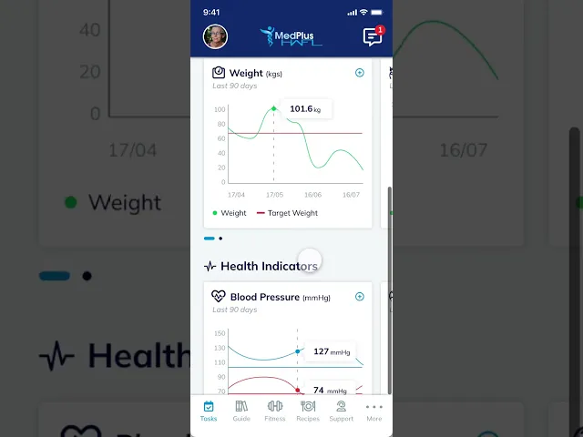
MedPlus HWFL is a prescribed weight management program that pairs medication with a care team. Before this project, patients were handed paper forms and left to stitch together their own tracking across notebooks, spreadsheets and random apps. The goal was to replace that fragmentation with a single mobile app — one place to track progress, see their plan, and stay connected to their healthcare team.
Date
Client
Prima Health
Skills
UX Design
Research
Mobile App Design
Prototyping

The problem
A clinical program separated by a digital divide.
While the MedPlus HWFL program was clinically sound, its reliance on offline tools created a disconnect between patients and their care teams. Patients were tasked with tracking complex weight-management metrics - such as activity, habits, and weight - using fragmented manual methods like notebooks or generic apps. Without a unified digital touchpoint, clinicians remained "blind" to patient progress between appointments. This lack of visibility led to a breakdown in accountability, causing patients to lose momentum and confidence in the program’s efficacy.
Who it's for
Early in the project, I mapped the two sides of this relationship as distinct personas. They share the same goal, the patient's long-term weight management, but they bring very different abilities, contexts and expectations to the software. Designing for one without the other would undermine the program's whole premise.
 Primary userPatients Mature-age adults referred to the HWFL program by their GP. Many have accessibility needs, larger font sizes, simple navigation, and forgiving interactions. They're not looking for a fitness app; they're looking for a clear, low-friction way to follow a medical program and stay in touch with their care team. |  Secondary userHealthcare professionals Clinicians and coaches support patients throughout the program. Tech-confident, time-poor. They need visibility into each patient's progress to make informed clinical decisions, and a way to communicate asynchronously, without another inbox to manage. |
The approach
To transition HWFL from a print-and-consultation model to a digital platform, I used the established offline workflow as our "source of truth." Collaborating with the CEO and cross-functional teams, I led the creation of wireframes and site maps that honoured the existing clinical logic.
We focused on filling functional gaps, like inter-appointment tracking, with features that felt like a natural extension of the program rather than an external "tech" imposition. By maintaining a tight feedback loop of peer reviews, we were able to stress-test our flowcharts against the patient experience, catching and correcting friction points long before they reached development.
Discovery & Research
To ensure the app resonated with its specific user base, I grounded the design in a multi-stage research process:
User Persona Research: I defined the primary patient profiles, focusing on older adults with chronic conditions to understand their technical confidence and physical accessibility needs.
User Journey Mapping: I mapped the "paper-based" experience to identify where patients typically lost momentum, ensuring the digital version addressed those specific pain points.
Application Flowcharts: I translated complex clinical protocols into logical digital paths, creating a blueprint that balanced medical rigour with ease of use.
Iterative Peer Reviews: By presenting wireframes and flows to the clinical team and stakeholders early, I validated that our digital solutions remained faithful to the program’s core values.
Design system
The client provided a print-based style guide, ensuring the visual identity remained consistent. However, the guide lacked digital-specific standards, omitting screen-optimised typefaces, icon systems, and accessible font-scaling logic. I leveraged this gap to build a robust digital layer, selecting typography and iconography specifically for an older patient cohort. By prioritising legibility and contrast, I expanded the brand's reach without compromising its established print identity.
Prototyping
I began by translating the clinical workflow into detailed wireframes, ensuring every screen served a specific patient need. These wireframes acted as the skeletal logic for the app, which I then evolved into a comprehensive, high-fidelity prototype in Adobe XD. This served as the central reference point for the entire team—not just a visual guide, but a functional map of the patient experience. Instead of debating abstract screens, we used the prototype to "live" the workflow together, catching friction points in real time. This shared clarity significantly streamlined the build: developers had a clear interaction guide, and we were able to export components directly into FlutterFlow, maintaining design integrity from the first click to the final deployment.

Implementation
The HWFL app is now live on iOS and Android, serving as the central hub for patients and their care teams. By developing in FlutterFlow, we were able to run usability testing in tandem with implementation. This agile approach allowed us to integrate refinements into the live build immediately, rather than letting them accumulate as post-launch technical debt.
Today, the app provides a stable, validated foundation that replaces fragmented paper systems with a single digital "source of truth." We are now moving from the build phase into the impact phase: monitoring real-time patient data to measure how this digital layer increases long-term adherence and clinical outcomes compared to previous manual methods.
Thank you very much for your work to date. I'm really pleased with the way it is coming together.
CEO, Prima Health
More Projects
Recent projects in web design and digital products


